What’s the width of child in pixel?
<div class="parent">
    <div class="child">
         some text
    </div>
</div>

<style>
.parent {
  width: 700px;
}

.child {
  width: 50%;
  background-color: green;
}
</style>
Of course it’s 350px
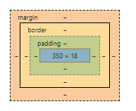
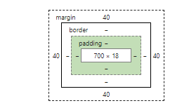
And the parent is like
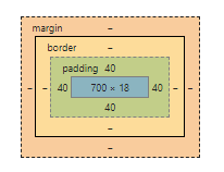
Let parent has padding
padding: 40px;
The result is the same
Width of child is still 350px
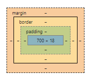
Btw ,the parent is now
Parent has padding + Child has padding
Let child has padding:
padding: 15px;
The result is
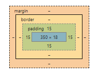
Width of child is still 350px
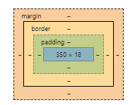
Let parent has margin
margin: 40px;

Width of child is still 350px
and the parent is
Parent has margin + Child has margin
Add margin to child:
padding: 15px;
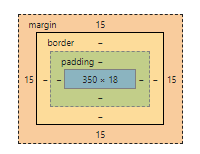
Width of child is still 350px
Conclusion: A child’s real width (not including padding/margin) = parent’s real width (not including padding/margin) * percentage
What if I use flexbox layout and flex-basis?
I tested it. Exactly the same.